

 Game Design
 Level Design
 ActionScript
 C#
C# 3D Modeling
 Drawing
 Pixel Art
 Pastry Paradise at Gameloft Auckland
 Stargate:Unleashed2 at Arkalis Interactive
 Keep it virtual! at Supinfogame (Machinima)
 SP_Escape at Supinfogame (Gears of War Map)
 Stargate TC (Half-Life Mod)
 Misc.
Misc. Adobe® InDesign CSx
 Hammer Editor
 Unreal Development Kit
 Unity 3D
 Adobe® Photoshop CSx
 Autodesk® 3D Studio Max


My skills / Vector graphics
 In spite of what we can think, the vector drawing is used for a long time in videogames. Among the first games using it: Asteroids. In this game, edges are displayed on the screen to depict all the game elements.
The vector drawing is a process where a drawing is made of points placed with coordinates, linked together with a stroke. Drawings can be visualized in any scale without any loss of details: The display is calculated and updated.
Since the 80's, the process envolved. With that process, we can create lines and now curves too. We can generate a custom stroke, with colors. Shapes can be filled in with colors, gradients, or with custom pictures with different levels of transparency, etc.
Of course, vector drawing today is more expensive than yesterday and isn't the best solution for videogames used for complex drawings. We would rather use it for specific interface elements, (scaleform on UDK) and we might prefer pixel, less expensive to render.
The main interest is the picture detail, best solution for printing. Its style, clean, is barely used in visual communication and in cartoon.
My skills
- Creating environments, characters with vector graphics.
- Flash animation.
- Use in communication: Creating logos and quality printable documents.

Task: PUMP IT! Interface V1.0
07.15.2010 Pump it! on 2010 at MXP4 - Skill:
  Vector graphics
Softwares:
 Adobe® Flash CSx
At the same time as the Game Design was progressing, I drew a first sketch of the Pump it! interface.
For this interface, I was inspired by the most played rhythm games on the moment: Guitar Hero, Rock Band.
The videogame we had to make was originally was meant for the David Guetta fanpage, so I dwelled on a design suiting with the musical style of the artist and his audience.
The data to display was:
- The game area with the four quadrants, the pump it button, the tones
- The X2 bonus multipliers on each quadrant
- The score, the fan number: Fans are added to the score at the end of a game
- The volume: the gauge depicting the collected tone number. At its limit, the player clicks on the pump it button at the center, when it's red.

Finally, the interface depicts a speaker with some tones sliding on it. The center is the tone collector point and corresponds to the button to click when the limit of the collector is reached. On each corner, bonus values are clearly identifiable thanks to their glowy design.
Concerning the tone sliding movement, we would think they should move from the center to the exterior because it corresponds to the sound propagation but, on the gameplay side, tones are harder to follow because the sight is on the four corners of the screen at the same time. It sounded better to keep a movement from corners to center.
A version 2
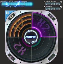
Between the first and the second version, we brought in question some gameplay features and readjusted the interface. I changed my job to coder at this time and the graphic designer in our team modified the design.
- The volume gauge was kept for the aesthetic but we had to add a sign to the center where the sight is focused. We put a gauge around the pump it button.
- The button red color was changed for a blue color.
- The multipliers are visible easier thanks to a X2 backgound that appears on each quadrant.
- The 4/3 aspect ratio became a square, we had to adapt.
- We added a pause feature we can trigger with the button on the top and left hand corner.
- Graphic design was refined.
Summary
This is the first interface of the game. I drew it at the beginning of the project.
Responsability: I designed the game screen.
Some pictures
Task: The fireflies
12.14.2009 Contre-Jour on 2010 at Supinfogame - Skill: Vector graphics
Softwares:
Adobe® Flash CSx
Summary
There are six fireflies in the game who are regulated by Eris, their queen. I did the concept art of these characters and drew them for the selection caroussel.
Work: Concept art and drawing for all the fireflies in Contre-Jour.
Some pictures


